FOR IMMEDIATE RELEASE
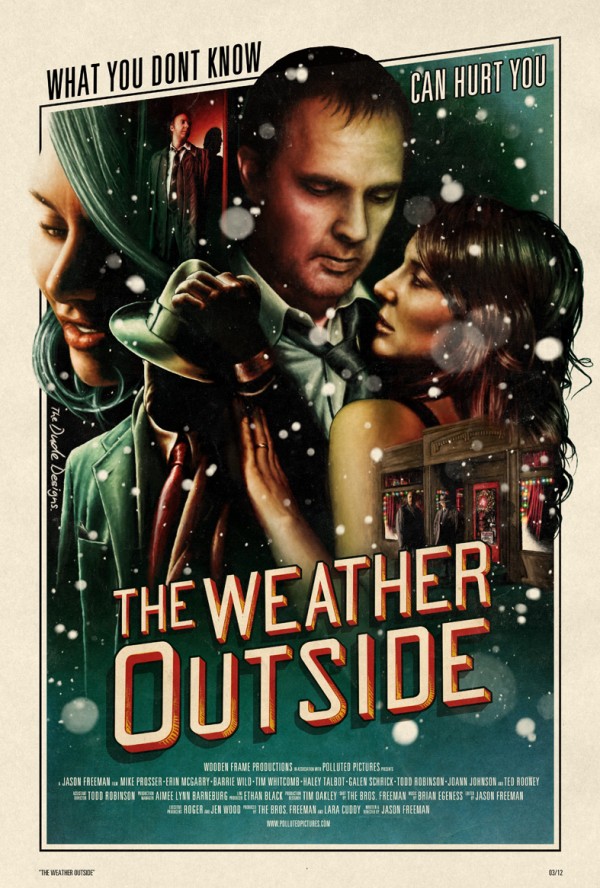
Poster from The Dude Designs released for the feature film, The Weather Outside.
PORTLAND, Oregon (April 03, 2012) With the feature film “The Weather Outside” getting ready to go to markets around the world in the upcoming months it is Polluted Pictures and Wooden Frame Production’s profound pleasure to present the Official Trailer and Poster for the upcoming romantic and darkly comedic film noir, The Weather Outside.
The Weather Outside is the story of Max who “finds himself separated from his family on Christmas Eve. He ultimately comes to the conclusion that his wife has left him and taken their children along with her. One year after the disappearance, he begins to discover that he might have one last risky chance to get them back.”
““We are so excited to have finished up post production on The Weather Outside. It’s been a long haul, but the time has finally come to let it go. To say that we are excited and proud of the final product would be stating it far too simply. I cannot wait for film fans across the globe to see it and judge for themselves.” – Writer and Director Jason Freeman.
https://vimeo.com/39678062
Tom Hodge, The Dude Designs says, “”When Jason (the Director) approached me about The Weather Outside it was an interesting proposition as the premises for the movie was one which I hadn’t touched on before… a Film Noir esque romance mystery!
So I got to play around with a lot of the visual language (or cultural baggage as my old film studies lecturer used to say) of this design to relate the films story back to the viewer.
We wanted the direction of the design to have that film noir aesthetic as it has such a rich history it instantly gives the viewer that visual connection for the films tone. The composition of the elements was an important factor (being a mystery romance) too in showing the interaction of the characters and there relationship to each other (Every element tells a subtle yet important part of the narrative). I wanted to have all elements merging into one another to show how they are interlinked which I did through the strong use of shadows, this also worked well to portray a darker atmosphere
I was going to angle the whole poster but it seemed too much so I kept it along the top to with the effective line break in the tag line, too really emphasis that and for the title, which I based off an amazing old 1920’s hand painted french type catalog, I was going to go for a classic script style but it looked too derivative of the film noir style, so I looked towards a more modern sans serif type with a 3D feel to lift it out and away from the main image.
For the coloring the director suggested we went down a more festive vibe to relate that back to the viewer without shouting about it.
Due to the title being derived from the song, I needed to get in some festive weather, so I experimented with different treatments, rain initially (as it does rain a lot during the film) but it looked to busy then as I tried to stylize it more it looked too much like Frank Miller’s work! So the snow (basically a more emphasized version flecks on the innkeepers) had a more romantic feel and nicely broke up all the flat black colouring and became a nice finishing touch which just polished off the design.”
The Weather Outside’s production company, Wooden Frame Productions, is currently in talks with Sales Agents as well as Distributors from all over the world.
Find out more and stay up to date with The Weather Outside at: www.theweatheroutside.com as well as www.pollutedpictures.com
Find out more about Tom Hodge and The Dude Designs at: http://thedudedesigns.blogspot.com/

